This 2020 has been a strange year full of changes, particularly in Chile. We have seen how brands, like all of us, have been adapting (some more, some less quickly) to the market, the environment, the public and its demands. Hence, if you don’t adapt, you die. My mother always says that you have to be like the reeds that bend and survive in the storm, while the hard rods break. I’m sure my mother didn’t invent this metaphor, but it’s relevant:
Your logo is not your brand
We have said this many times, but we still have clients who come to us with the idea that their logo must be used in such and only such a way. That not only makes the brand incredibly rigid but it is also not true. In any case, every logo should have at least a negative or inverted version ¡at least!
The importance of creating brand guidelines
Don’t get me wrong! I am a firm believer that every brand should have its manual or brand guidelines of graphic rules to follow. It’s not about not following the rules, it’s about knowing how to break them. Conditions of today’s world include:
- various platforms available,
- brand touch points and
- events with which certain companies and businesses must tune in,
So, given such conditions, a brand can choose to create dynamic logos.
Dynamic logos (Polymorphic)
Polymorphic – Polymorphism:
CHEMISTRY: The property of some bodies to vary in shape without altering their nature and composition.
BIOLOGY: Variety of form presented by individuals of the same species.
LINGUISTICS: Coexistence within a language or dialect of forms belonging to different linguistic systems.
Did you know that organizations and companies refresh or redesign their image on average every 7-10 years? This is a necessary process that can be done more or less often depending on market expectations and internal objectives that the company expects to meet. However, today a new concept of polymorphic logo or dynamic brand is emerging. This allows companies to make their identity more flexible without losing sight of the heart and strategy of the brand.
We all take for granted that a logo must always be the same to fix the visual image of the brand. And it doesn’t seem to make sense for a brand not to always use the same color, or the same shape, or the same typography. But listen carefully because it does! And it does it because, according to Gestalt Psychology, the way we perceive visual stimulus gives preference to the whole over the sum of its parts. This means that we do not need to have all the information to decipher what we see and therefore to relate concept to image. For this reason, you will be pleased to read this txte that semes to have no sesen: because the whole is more important than the sum of its parts.
José C. Del Pozo – Waka
Some international references


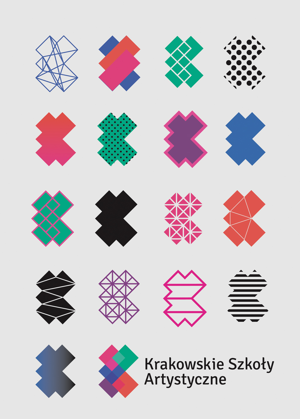
As we can see in the above examples, a dynamic brand and the use of polymorphic logos are an excellent solution when it comes to identifying organizations whose essence is dynamic and changing such as cities, schools, universities, TV channels and more. All of them are perfectly recognizable, perfectly coherent in their communications and yet with the ability to move and change.
What about the brand manual or brand guidelines? Don’t worry my engineer friend, the manual still exists but just like the brand, it adapts; it no longer gives us rigid graphic rules to follow. Instead, it shares with us a range of possibilities, a library of colors, shapes and textures. As a result, we can play and it gives us room for more creativity within the limits it deems necessary.
An excellent example of this is the work done for ABSTRA. An architecture studio located in the city of Punta Arenas (Chile) that carries out all kinds of projects for young entrepreneurs in the area with a multifaceted and integral team. They wanted their brand to reflect the rigor and dedication they put into their work but at the same time include that x-factor that makes them different, strange, vibrant and adaptable.

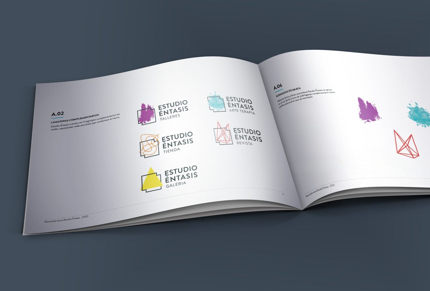
Another project we were lucky enough to work on was ESTUDIO ENTHASIS, the new project of artist Andrea Galdames that opens this contemporary art space in the city of Viña del Mar. The development of dynamic logos for each of the areas was a success that allowed us to differentiate the courses, the gallery, the magazine, the store, etc…
If you have doubts about the identity of your brand and want advice do not hesitate to contact us. You can write to us at hola@heydiseno.cl or write to us here.