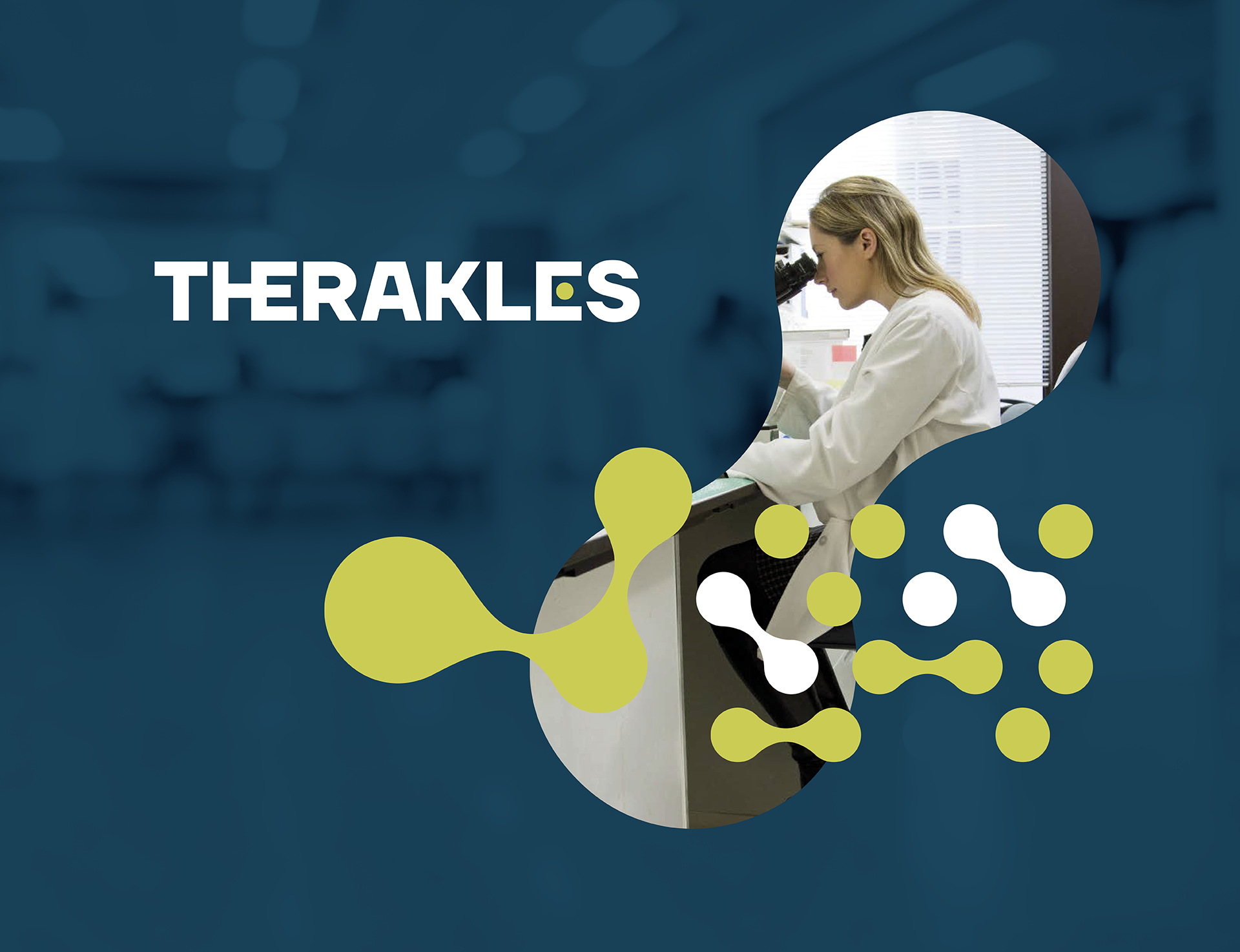
Therakles
At Hey Diseño, we developed the visual identity for Therakles, a biotechnology company and emerging player in the field of nuclear medicine specialising in the development of precision radiopharmaceuticals for cancer treatments. Its mission is clear: to create a highly targeted and safe therapy that specifically attacks cancerous tumours, minimising adverse effects compared to conventional therapies.
The design challenge began with a deep understanding of its purpose and the history behind its name. “Therakles” combines the root “Thera-“, from therapy, with “-kles”, in reference to Heracles, the mythological hero who defeated the giant crab. This metaphor of cancer as an adversary to be defeated became a conceptual axis of identity.
The typographic logo conveys solidity and scientific precision. The geometric letters and the design of the “E”, inspired by the idea of a key opening a lock, symbolise the effectiveness of the radiopharmaceutical, capable of targeting only the tumour without damaging the rest of the body. The colour palette, composed of deep greens, blue and bright accents, reinforces the association with technological innovation, trust and life.
This project represents a very special milestone for our studio: it was not just about designing a logo or a graphic system, but about translating the essence of a pioneering scientific company into a coherent, solid and forward-looking brand. We were truly proud to contribute our work to the science ecosystem in Chile, collaborating with an organisation that is at the global forefront and has a real impact on people’s health and well-being.


